
Ellum Studios
October, 2026
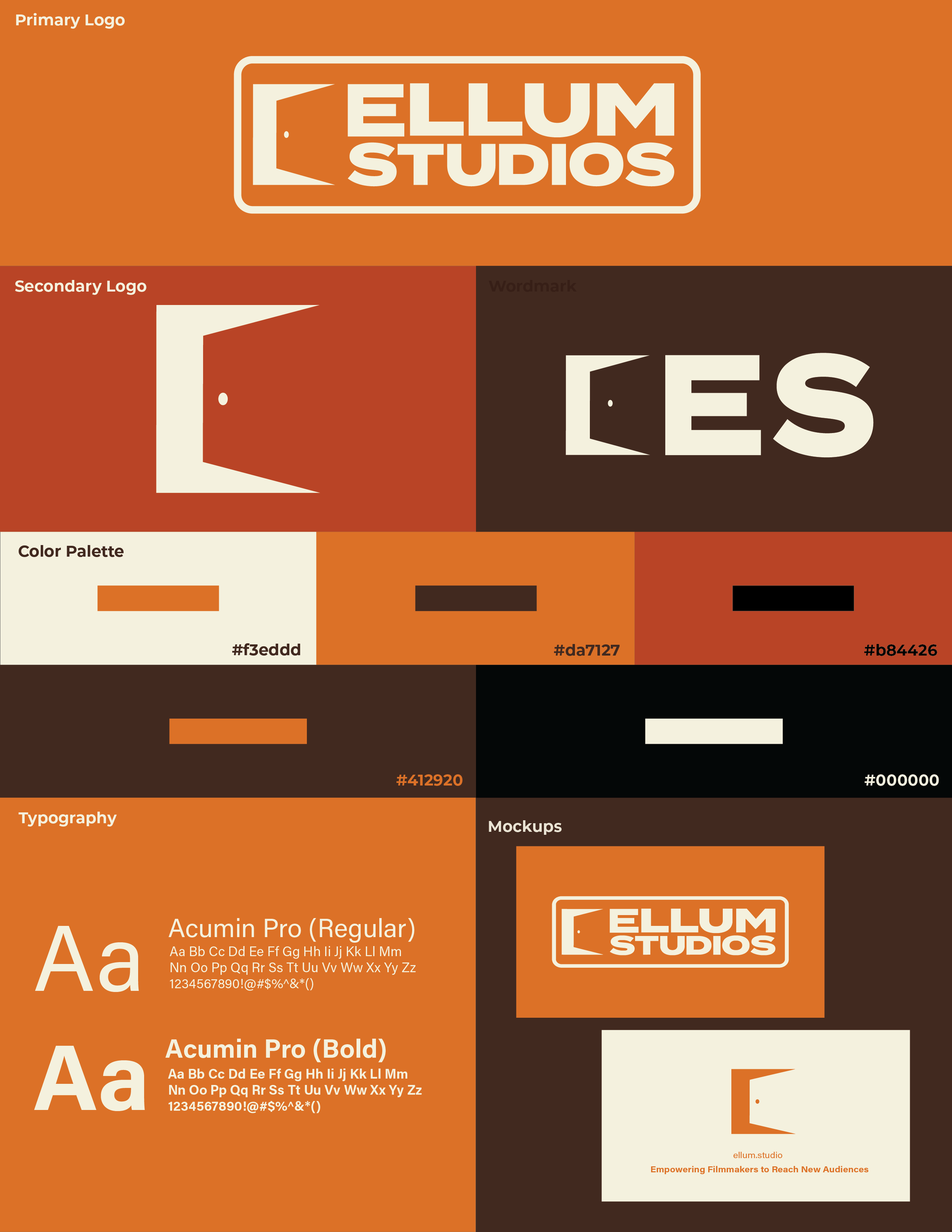
Ellum Studios is a Dallas nonprofit that helps independent filmmakers reach audiences through marketing, distribution, and community support, so the brand needed to feel welcoming to the filmmakers it serves while still looking established enough to work with productions and partners.
The logo is built around an open door, a simple mark that stands for access and the first step into the industry. In the primary logo, it sits beside bold, wide lettering inside a rounded container, which keeps the lockup compact and easy to recognize. The palette is warm and earthy, with a burnt orange and rust paired with a creamy off-white, and a deep brown and black for contrast. That gives it a grounded, slightly retro film feel that stays readable across applications.
The final system includes a primary logo, a standalone door mark, and an “ES” wordmark, along with Acumin Pro in regular and bold and a five-color palette, so it works on anything from business cards to social graphics. The goal was a confident, approachable identity that looks as ready for a partnership meeting as for a festival lineup.
Lowtide
October, 2026
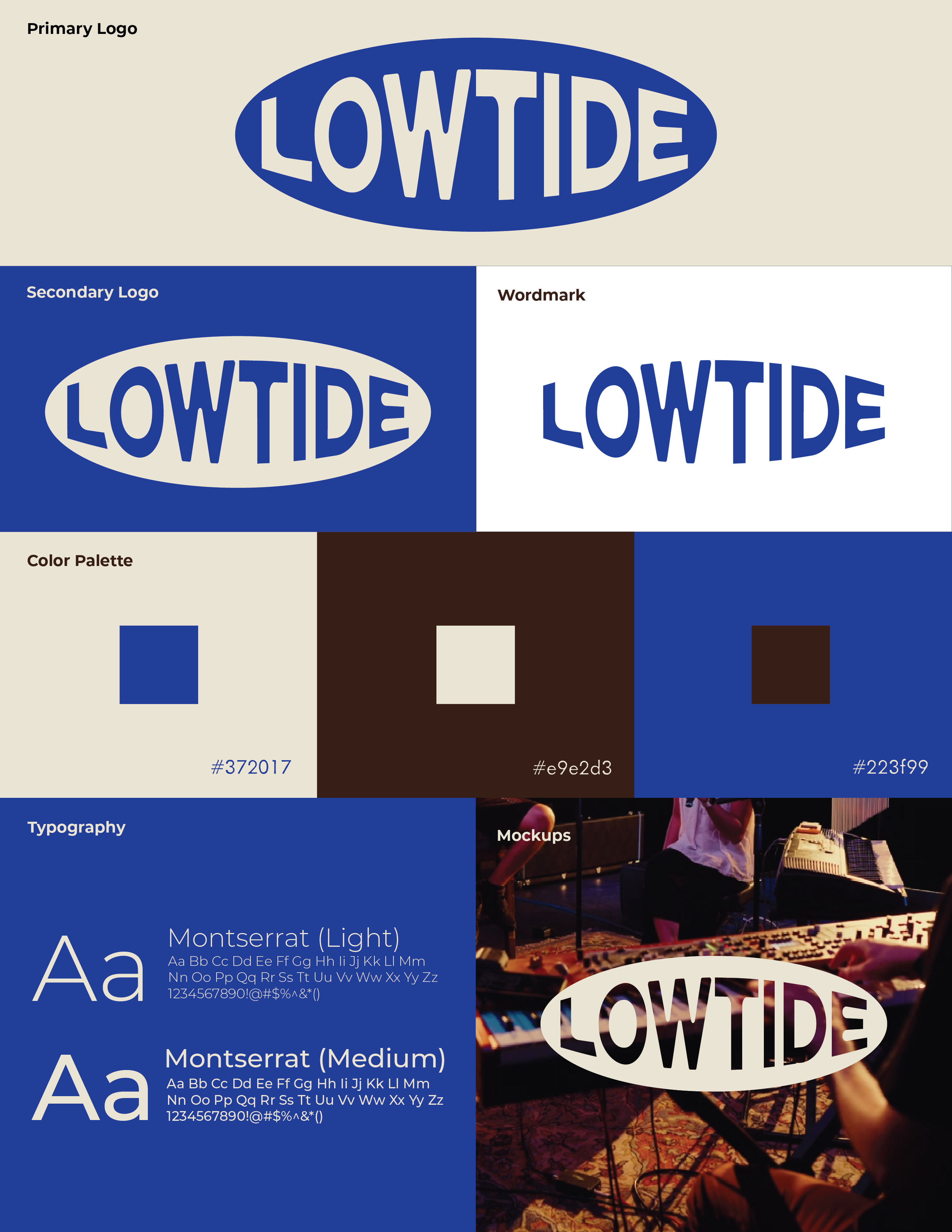
Lowtide is a company built around highlighting independent artists through filmed performances and marketing, so the brand needed to feel like it belonged to the artists it features: handmade and rooted in community, but backed by a professional structure.
The logo takes its cues from vintage stickers and college crests, using a contained oval and bold, slightly warped lettering that reads as familiar and nostalgic. I started with a vibrant royal blue and a deeper ivory, then adjusted both to feel faded and sun-worn, which gave the palette a vintage character without losing legibility.
The final system pairs a primary logo, secondary logo, and standalone wordmark with Montserrat typography and a limited three-color palette, so it holds up across everything from video titles to social content. The goal was a vintage indie feel with clear intention and a professional finish.
Personal Brand
August, 2026
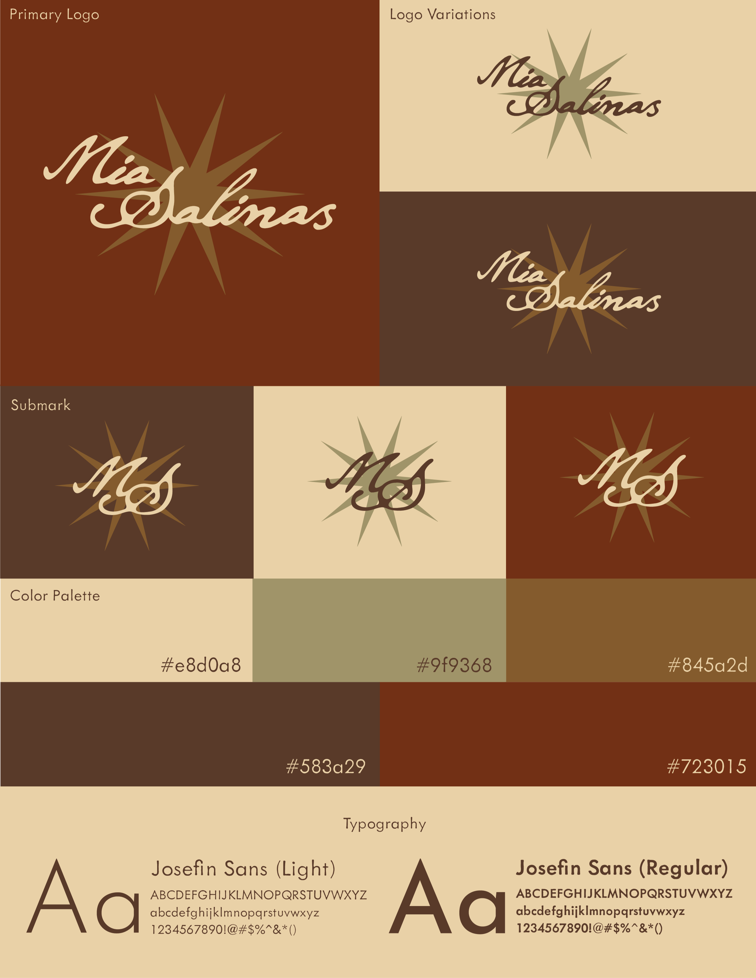
This identity was created for my portfolio site and designed to represent me as a creative without competing with the work on the page. The wordmark uses a flowing script inspired by handwritten letters, which gives it a personal, human feel, and a radiating star behind it adds warmth and a focal point.
For the palette, I wanted something warm and varied but restrained: a range of earthy browns, a muted olive, and a soft cream, which add depth beyond a monochrome scheme without overpowering the logo. Josefin Sans, in light and regular weights, keeps the supporting text clean and modern against the script.
The system includes a primary logo, color variations, and an “MS” submark, so it works across a full site, from the header to the favicon.
M Records
July, 2026
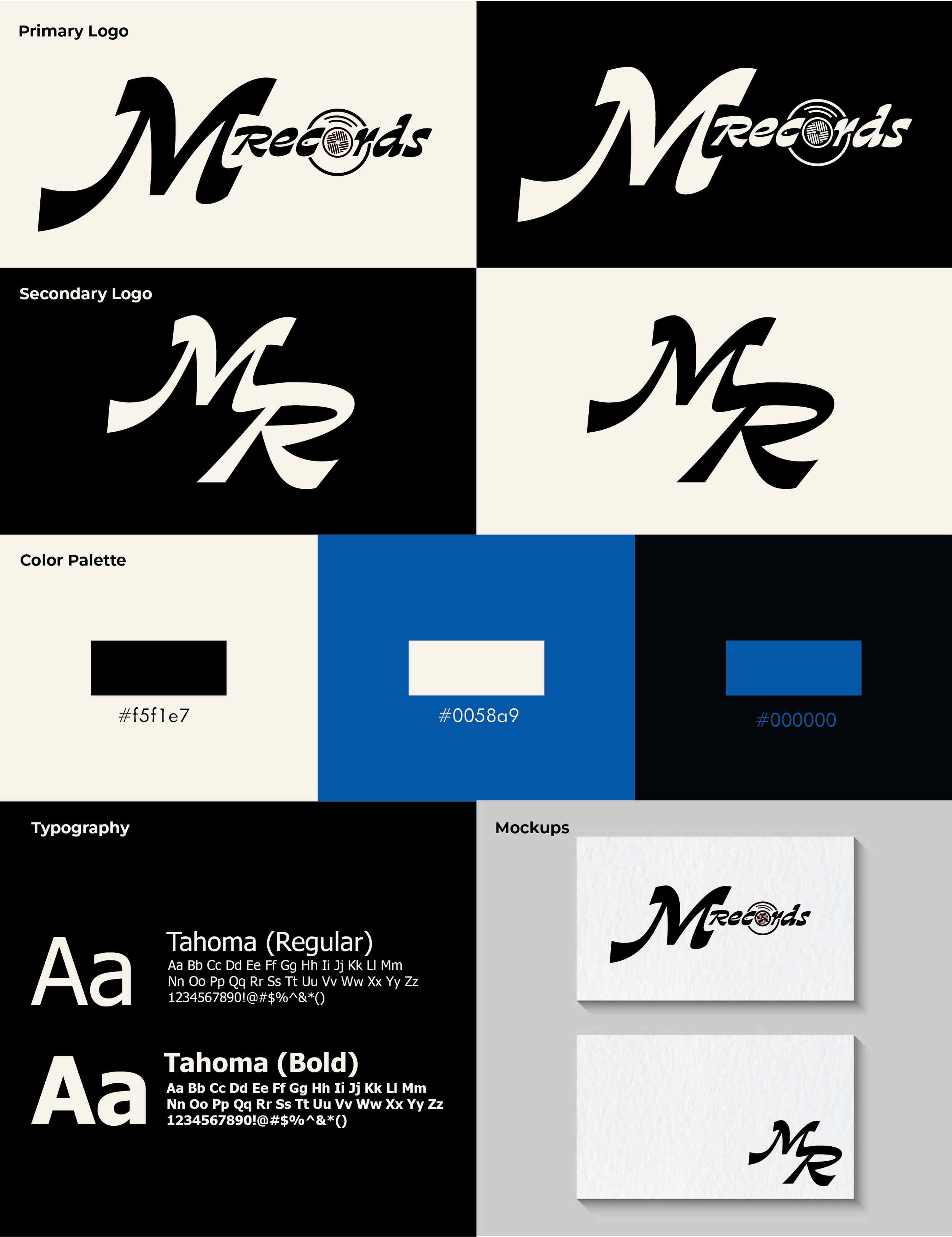
M Records is a design exercise for a speculative record label, and it was my first real experiment with typography and with integrating illustration into a logo. I focused on how the lettering itself could carry the personality of the brand, using an expressive, flowing “M” paired with a compact “records” wordmark. I then worked an illustrated record into the wordmark so the illustration became part of the type instead of an add-on.
The identity includes a primary logo, an “MR” monogram for tighter spaces, a high-contrast black and cream palette with a blue accent, and Tahoma typography. I also built business card mockups to test how the marks hold up in a real application. The project was made as an experiment in letterform and how typography can shape a brand.